Messy search page
How to make AI images look less stock and less fake.
When an AI image looks plastic, generic, or like a stock-photo template, the missing input is usually art direction, not more adjectives.
Use these terms
Editorial photography
Signals a real profile, magazine, campaign, or documentary image rather than a generic stock-photo pose.
Art direction
Defines the taste, mood, styling, references, and visual rules for the whole image.
Production design
Controls setting, props, wardrobe, surfaces, and the world the subject lives in.
Cinematic lighting
Adds motivated light, shadow, contrast, and believable atmosphere.
Photorealism constraints
Pushes the output toward natural skin, realistic hands, and believable physical detail.
Negative prompt
Names the artifacts to exclude: plastic skin, distorted hands, fake text, oversaturation, and generic stock-photo poses.
Prompt pattern
Weak ask
Make this image premium and realistic, not AI-looking.
Exact Terms ask
Create the image with editorial photography, clear art direction, intentional production design, cinematic lighting, photorealism constraints, and a negative prompt for generic stock-photo and synthetic AI artifacts.
Visual proof
Same brief, different vocabulary
This is the practical difference: vague adjectives tell the model the mood you want, but expert terms tell it how to build the image.
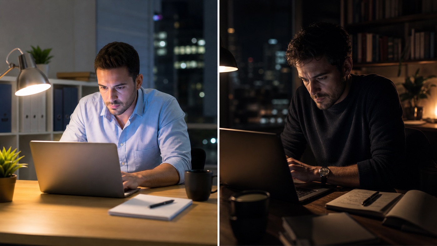
Make an image of a founder working late. Make it premium and realistic, not stock.
Create a premium editorial photograph of a founder working late in a quiet office, with cinematic motivated key light, intentional production design, natural unsmiling pose, realistic hands, 50mm portrait lens feel, shallow depth of field, restrained color grading, tactile desk materials, documentary realism, and a negative prompt for stock-photo poses, plastic skin, fake text, warped hands, and oversaturated AI gloss.
The brief stayed the same
Both prompts ask for a founder working late. The difference is that the vague prompt leaves style, lighting, lens, and artifacts for the model to guess.
The lighting became intentional
Cinematic lighting gives the model a motivated key light, shadow, and contrast instead of flat laptop glow.
The scene gained taste
Production design and restrained color grading replace generic office props with a believable visual world.
The artifacts were named
A negative prompt blocks the stock-photo pose, plastic skin, fake text, and synthetic polish that make AI images feel cheap.
Related guides
Art direction vs. editorial photography vs. cinematic lighting: which AI image term should you use?
A practical guide to art direction, style keywords, editorial photography, cinematic lighting, lens choice, production design, and negative prompts for AI images.
The AI vocabulary map.
A practical map of expert vocabulary across image generation, coding agents, product UX, startup validation, and buyer messaging.
AI image style keywords when you can picture it but cannot name it.
AI image style vocabulary for better generations: editorial photography, cinematic lighting, art direction, composition, lens choice, color grading, material texture, and negative prompts.
AI image vocabulary cheat sheet.
A visual vocabulary cheat sheet for art direction, editorial photography, lighting, lens choice, composition, texture, and negative prompts.
Common questions
Why do AI images look like stock photos?
The input often names the subject but not the visual world, lighting, lens, composition, styling, and defects to avoid.
What is the fastest fix?
Add art direction, one camera or lighting term, one production detail, and a negative prompt for the artifacts you keep seeing.